How do you position a cash-based chiropractic practice in a market dominated by rushed, insurance-driven competitors? When analyzing competitor reviews revealed that 67% of patient complaints weren't about results but about feeling rushed and overlooked, we saw the opportunity. Here's how we built Adjusted Wellness into a premium brand that justifies higher-tier pricing through precision care and genuine attention
deliverables__
_Brand Foundation Strategy
_Ideal Customer Persona Development
_Logo System
_Waiting List for Open House
_Print Marketing Design
Category:
CLIENT:
ADJUSTED WELLNESS CHIROPRACTIC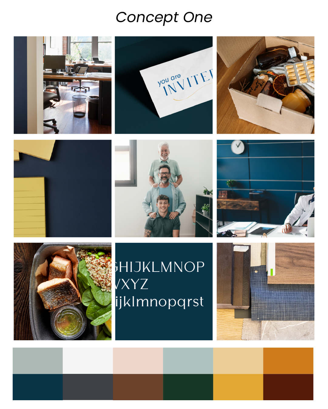
creative direction_
The original logo was outdated, included shading in the file that limited usability, and the business name had changed.
BUT, it held sentimental value to Stacie as it was inspired by her father’s entrepreneurial spirit and his business logo that we needed to honor.
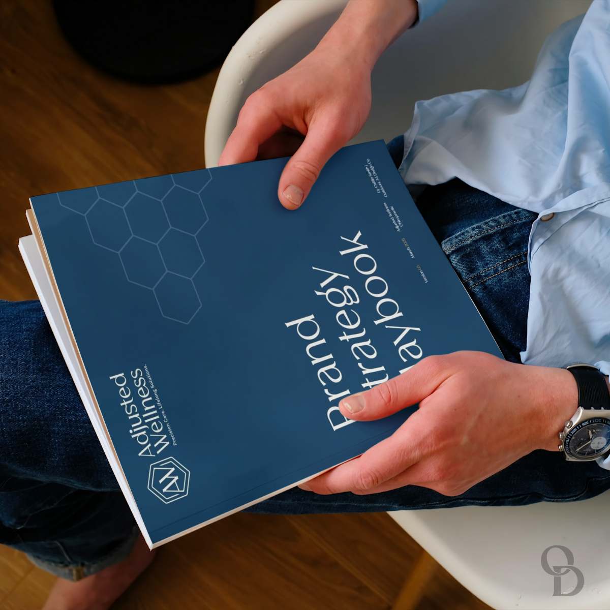
brand strategy playbook_
Stacie was very inspired and felt the most comfortable in the vibe of ‘Joanna Gaines’ but we also recognized her ideal target audience are entrepreneurs, founders, and successful business owners, statistically a larger pool of men. We need to balance her desire of hospitality and calming spaces with professionalism and the strength necessary to portray her role.

The open house_
Balancing the feminine and masculine energy for this brand was going to be vital for their positioning in the marketplace and ultimately success in attracting the right audience and validating how referrals describe working with the brand.

the challenge_
Dr. Dan Elmore wanted to launch a chiropractic practice that broke free from the industry’s typical “assembly line” approach.
His vision: a concierge-style clinic using precision-focused techniques, but he needed to differentiate from volume-driven competitors and attract patients willing to invest in premium care.
The breakthrough: Position a cash-based practice as the premium alternative by directly addressing what frustrates patients about typical chiropractic experiences.
↓ How We Identified the Opportunity ↓
The Research Approach: Instead of traditional market research, we analyzed hundreds of competitor Google reviews to find patterns in what actually frustrates patients.
The Insight:
67% of complaints weren't about results—they were about feeling rushed and treated like numbers. Hidden billing surprises appeared in nearly half of negative reviews.
The Strategic Decision: Rather than compete on price or convenience, we positioned directly against these pain points: "Precision Over Volume" and "Trust Through Transparency." This let Dr. Elmore charge premium rates while attracting patients who were already frustrated with typical experiences.
Brand Strategy & Messaging_
We developed messaging that spoke directly to patient frustrations while highlighting Dr. Elmore’s concierge approach. Key themes like “You’re not just a number” and “Get it right the first time” positioned quality over quantity.
The result: Clear differentiation that justified premium pricing and attracted ideal patients seeking personalized care.
↓ How we crafted the messaging ↓
The Messaging Strategy: Each key message directly countered a specific competitor complaint: "You're not just a number" (vs. feeling rushed), "No surprises, no pressure" (vs. hidden billing), "Get it right the first time" (vs. endless return visits).
The Target Insight: We focused on patients household earnings of $75K+ who were already frustrated with chiropractic experiences or who are interested in holistic options because they're lacking the long-term results they want but are hesitant due to false perceptions through other's experiences. These people would pay premium prices for genuine attention—they just needed to know where to find it.
Supporting the Business Model: The messaging had to justify $75-125 per visit in a market used to $20-$80 insurance co-pays. By positioning it as "investment in precision care" rather than "expensive healthcare," we reframed the value proposition entirely.
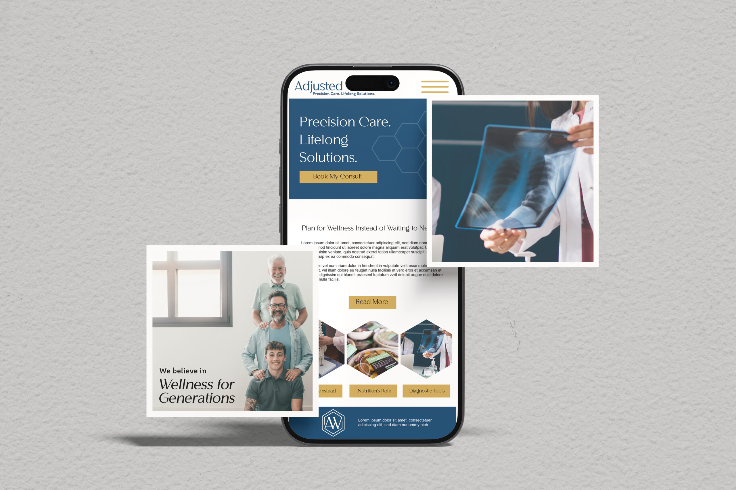
visual identity system_
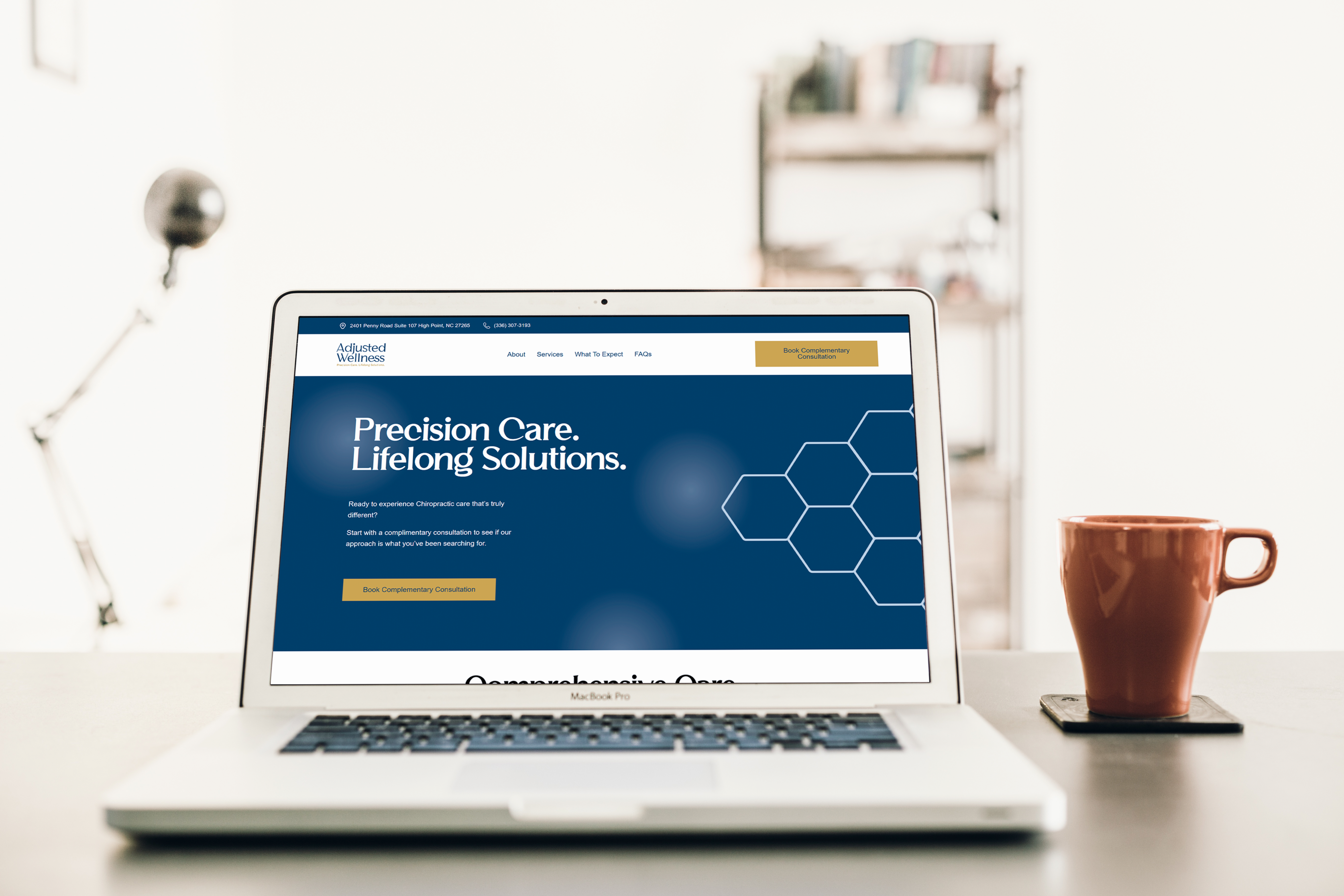
The hexagonal logo reflects interconnected wellness while suggesting precision and stability. The sophisticated color palette—deep blues for trust, earthy greens for natural wellness, gold accents for premium positioning—creates professional credibility without clinical coldness.
The impact: A visual system that elevates chiropractic care from medical necessity to wellness investment.
↓ How we designed for impact ↓
The Logo Concept: The hexagon wasn't just aesthetic—it represents interconnected wellness while suggesting the precision of the Gonstead technique. Geometric stability conveys trust without feeling cold or clinical.
Color Psychology in Action: We used 40% sophisticated blue (trust/expertise), 20% grounded green (natural wellness), and 10% gold (premium positioning). The proportions were strategic—enough blue for credibility, enough green to feel approachable, just enough gold to signal quality without seeming flashy.
The Accessibility Factor: Every color combination was tested for ADA compliance as usual, but since Dr. Elmore has color vision issues we wanted to make sure not only would the ideal patients be attracted to the visuals but that Dr. Elmore also could see his brand in a delightful way. This wasn't just about legal requirements—it ensured his brand would be inclusive to patients with similar challenges and that what he sees is what he loves too.


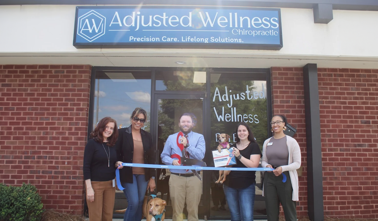
Pre-Launch Strategy_
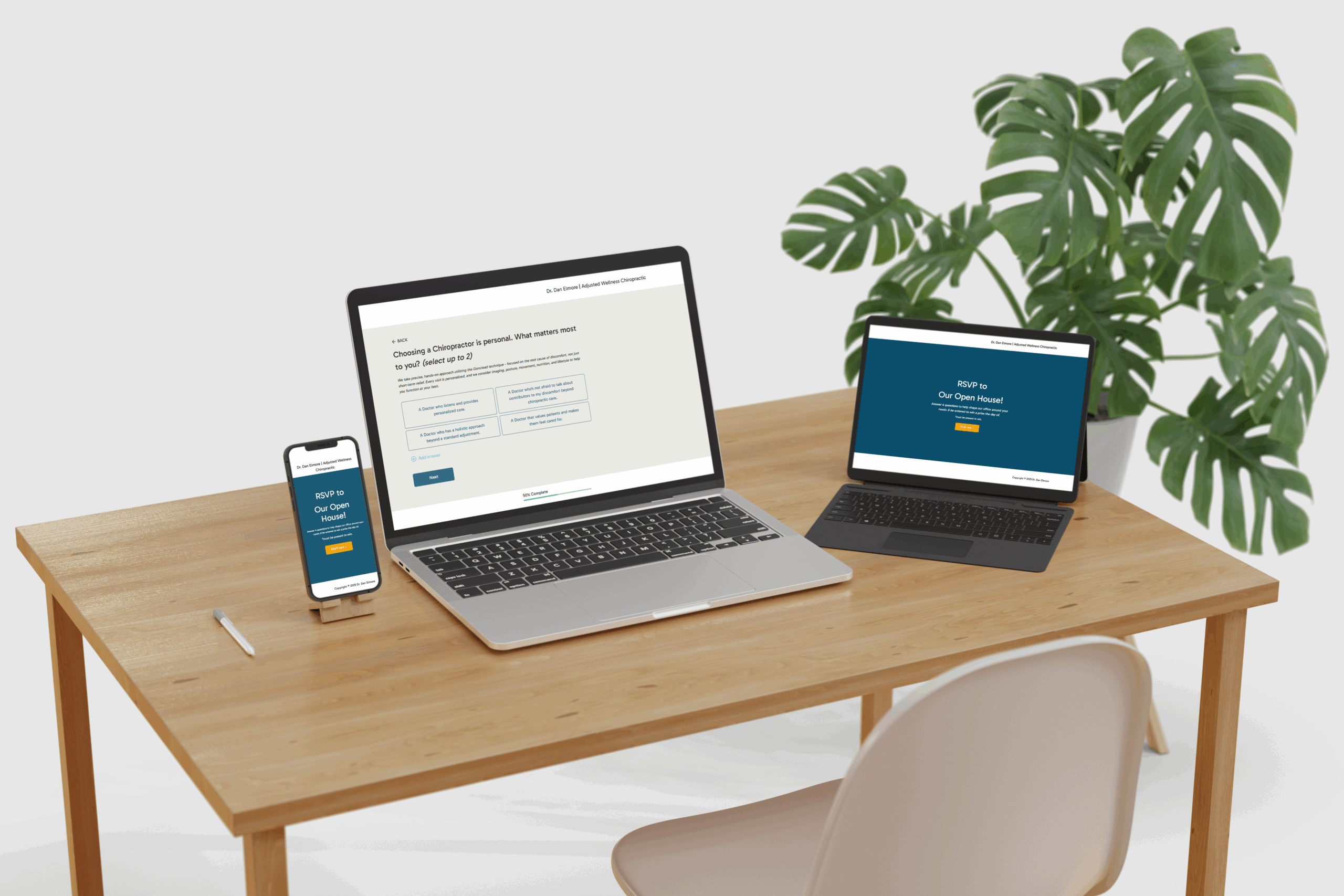
Created an Open House RSVP system with strategic intake questions to build a patient database before opening. This allowed us to gather demographic data, test messaging effectiveness, and create market anticipation.
The outcome: A qualified lead list and valuable market insights before the practice officially launched.
↓ How we planned the launch ↓
The Open House Strategy: Instead of a typical "grand opening," we designed an exclusive preview with strategic intake questions and community partnerships. The goal was to build a qualified database while creating intentional buzz through Dr. Elmore's networking circles and complementary providers who could cross-promote to their audiences.
The Reality Check: Between equipment delays and office setup challenges, the timeline compressed significantly. What started as a planned community event became a Chamber of Commerce ribbon cutting with solid but limited attendance. This taught us something valuable: in this market, relationship-building works, but it needs more lead time and systematic execution to reach its full potential.
The Strategic Insight: The attendees who did come were from Dr. Elmore's strongest networking relationships - and those connections are now generating his steady patient flow of 2 new patients per week. This validated that the relationship-based approach works, but showed us it needs to be the primary focus rather than supplemented by events.
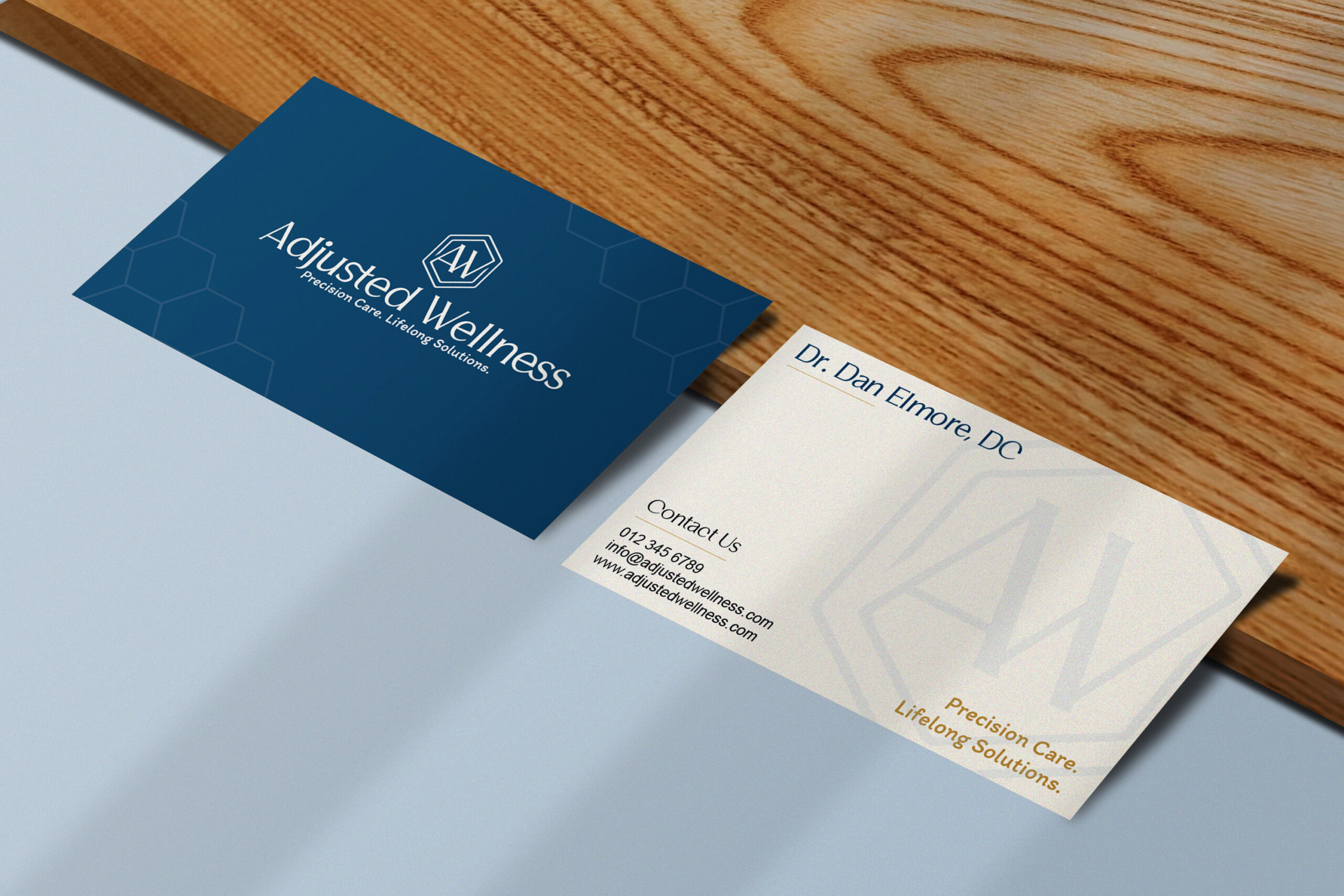
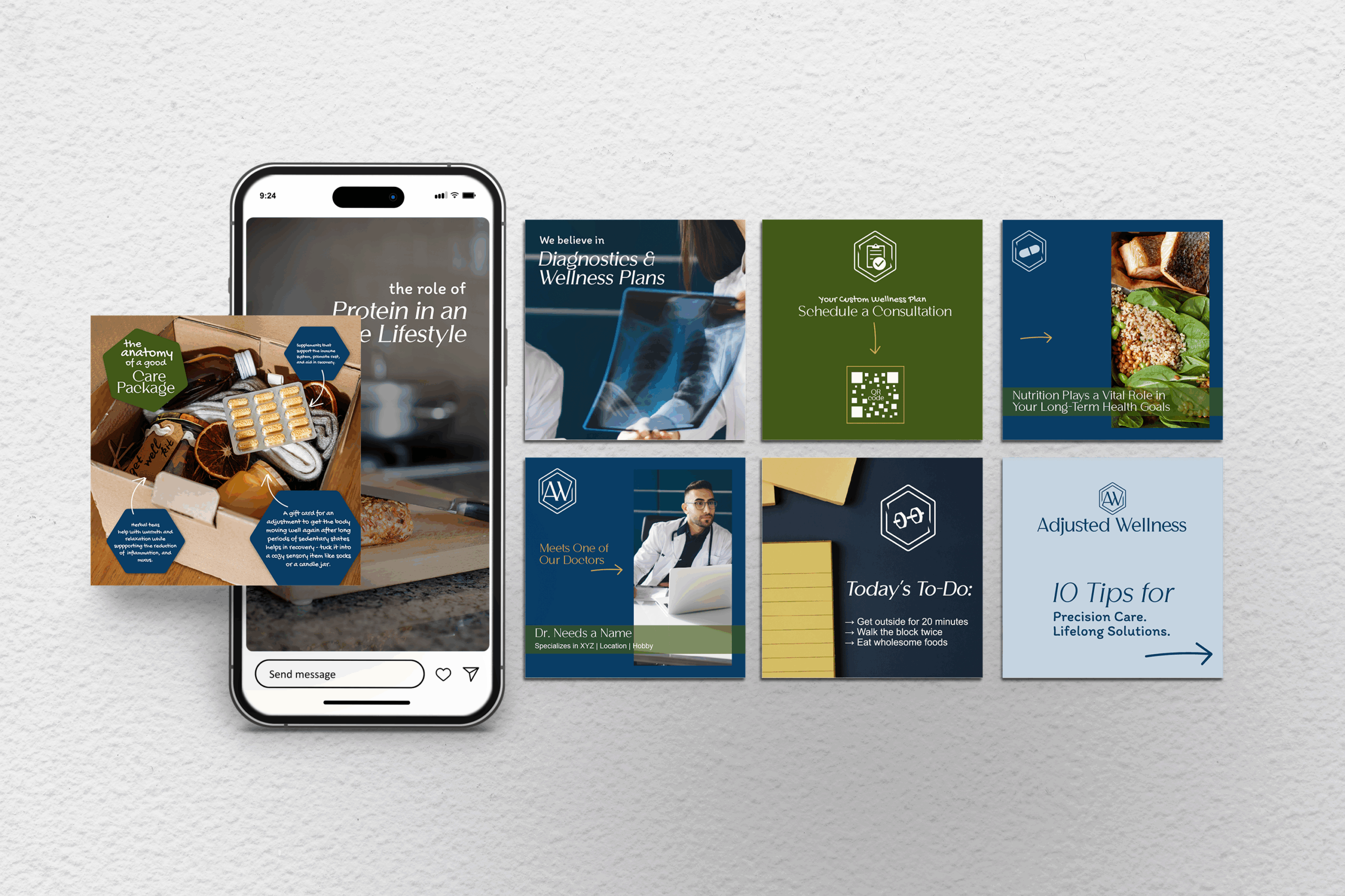
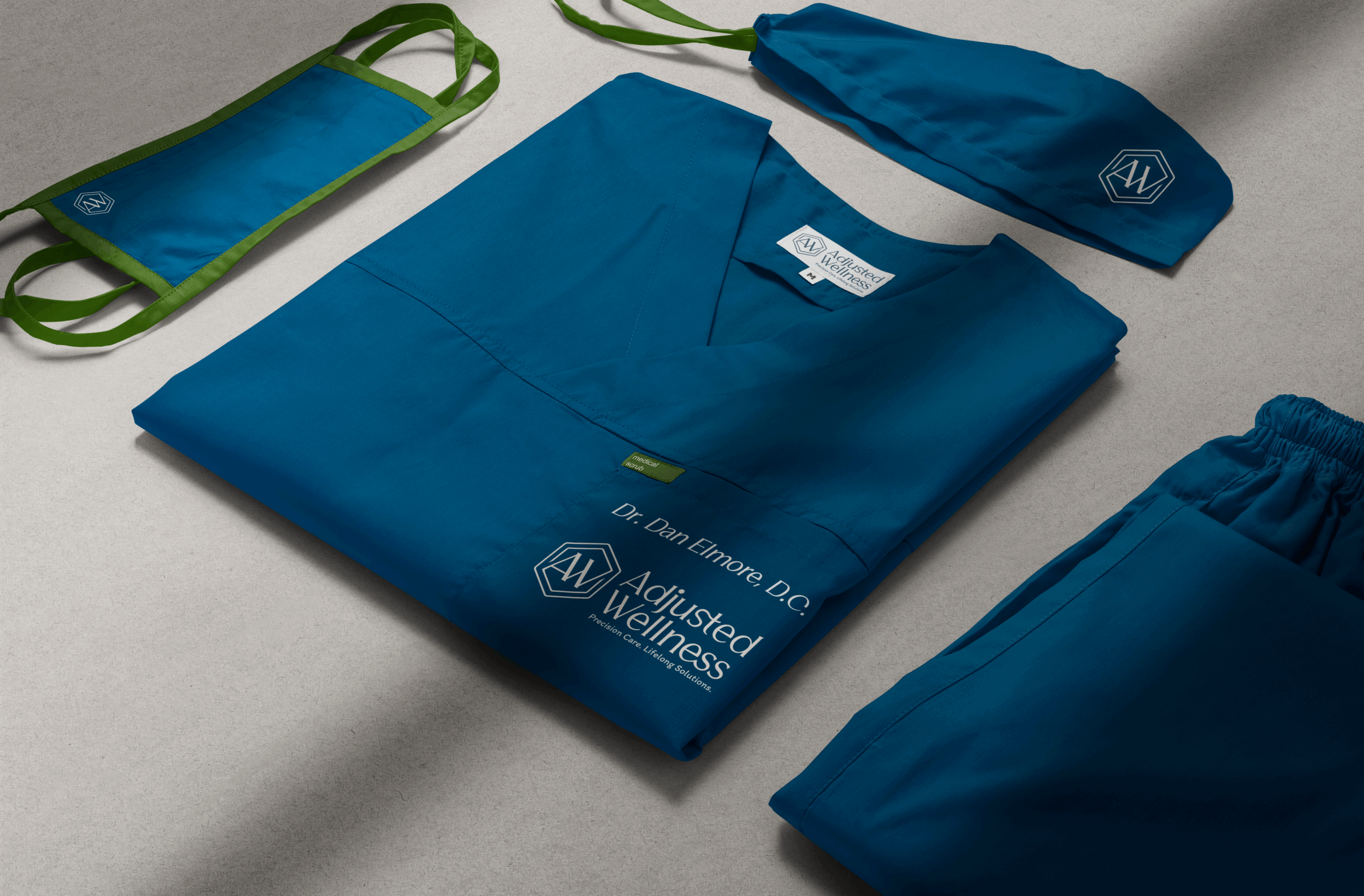
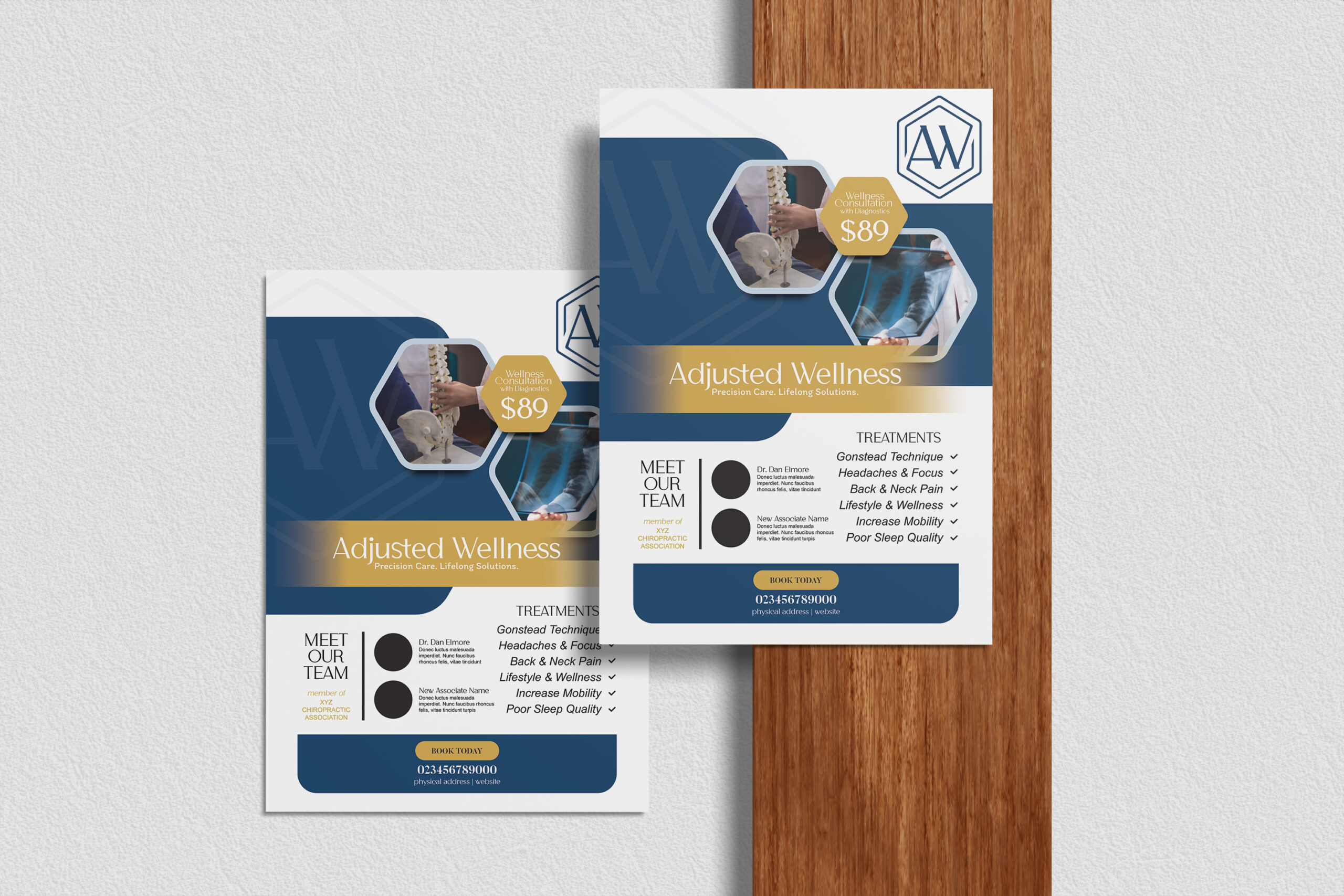
Brand Applications & Experience Design_
Extended the brand across all patient touchpoints—from professional signage and business cards to branded apparel and educational materials. Each element reinforces the premium positioning while maintaining approachability.
The result: A cohesive brand experience that builds trust from first impression through ongoing care.
↓ How we extended the brand ↓
The Experience Design: Every brand touchpoint reinforces the "precision and personalization" promise—from the professional exterior signage that elevates the practice's perception to educational materials that extend care philosophy beyond appointments.
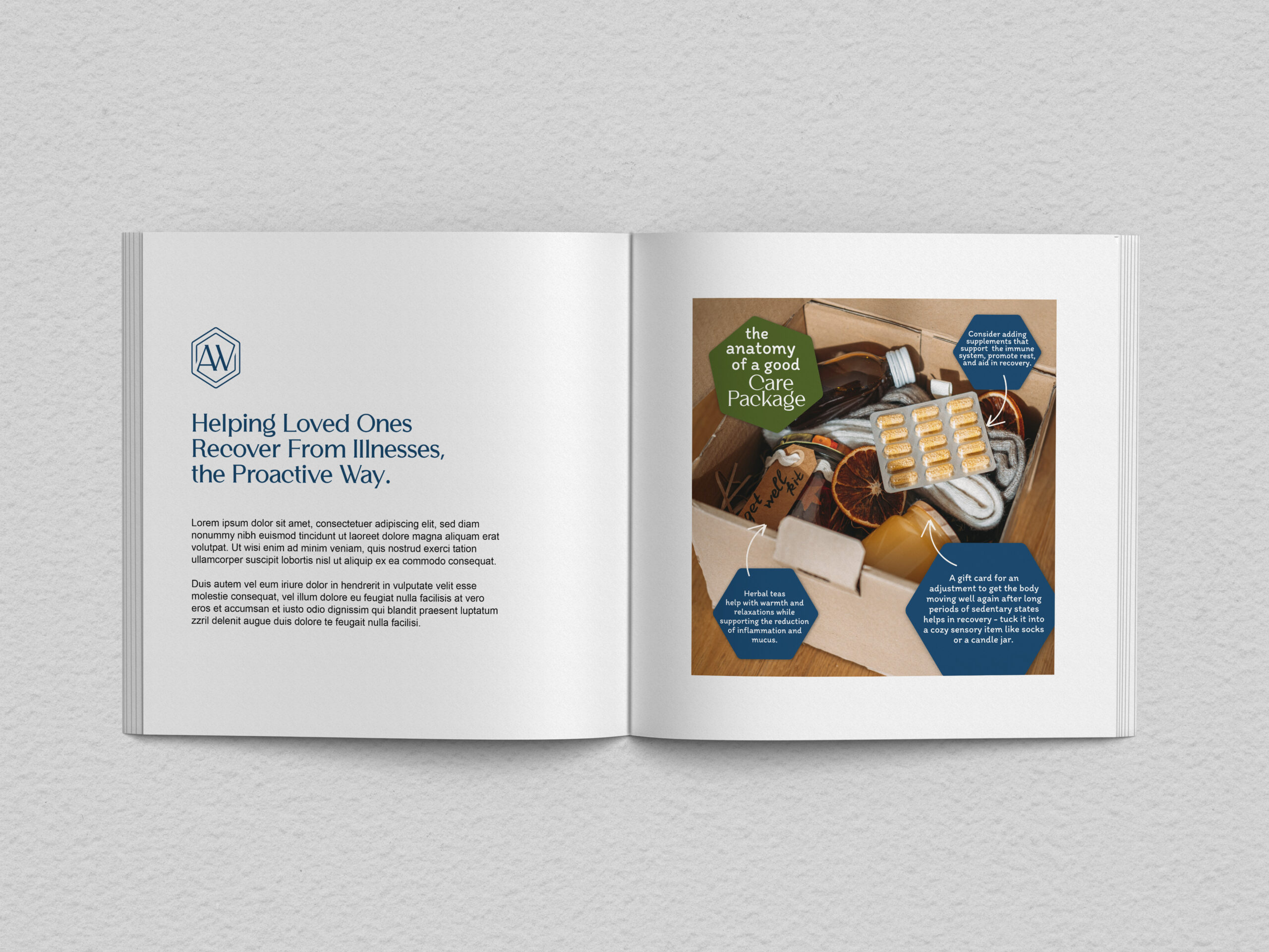
The Smart Application: We designed branded "care packages" and useful promotional items (beyond typical pens) that patients would actually use—mint packs, mini ice packs, lip balm—creating mini brand experiences in daily life.
Early Results: 100% 5-star Google reviews specifically mention "great care," "amazing experience," and personalized attention—exactly the brand differentiation we designed for. The visual identity is doing its job of attracting and retaining the right patients.

Results & Impact_
The brand foundation successfully positioned Adjusted Wellness as the premium alternative in the local market. Early patient feedback shows 100% 5-star reviews highlighting “great care,” “amazing experience,” and personalized attention—exactly the differentiation we aimed to achieve.
Client testimonial: “You did great… I’m glad I went with you instead of the ‘el cheapo’ artificial intelligence route… the colors do a good job of emphasizing stability with expertise. That’s my overall goal anyway.” – Dr. Dan Elmore
↓ How we measured success ↓
The Brand Validation: 100% 5-star Google reviews with patients specifically using our brand language—"great care," "amazing experience," and praising the personalized attention. The messaging is working exactly as designed.
The Business Model Success: Dr. Elmore is successfully operating cash-based in an insurance-dominated market. Patients are choosing quality over convenience, validating our premium positioning strategy.
The Long-term Foundation: While current growth (2 new patients/week) is slower than hoped, the brand strategy provides the framework for sustainable expansion—clear premium positioning, community trust, and referral relationship development that will compound over time.