Stacie was a seasoned funding advisor wanting to honor her father's legacy while building her own boutique practice. We created more than a rebrand—we built a strategic partnership that transforms how entrepreneurs launch their dreams. This case study reveals how thoughtful brand strategy became the foundation for immediate credibility, rapid business growth, and an ongoing collaboration that delivers seamless support from funding approval to market-ready launch. Discover how one strategic brand partnership elevated two businesses and created a white-glove experience that clients call "tremendously less stress than other options.
deliverables__
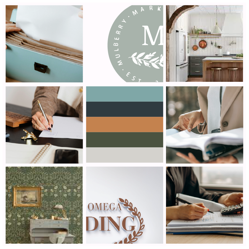
_Brand Strategy _Ideal Customer Persona Development _Logo & Identity System _Custom Brand Illustrations _Custom Brand Patterns _Print Marketing Design
The original logo was outdated, included shading in the file that limited usability, and the business name had changed.
BUT, it held sentimental value to Stacie as it was inspired by her father’s entrepreneurial spirit and his business logo that we needed to honor.
the inspiration_
Stacie was very inspired and felt the most comfortable in the vibe of ‘Joanna Gaines’ but we also recognized her ideal target audience are entrepreneurs, founders, and successful business owners, statistically a larger pool of men. We need to balance her desire of hospitality and calming spaces with professionalism and the strength necessary to portray her role.
The creation_
Balancing the feminine and masculine energy for this brand was going to be vital for their positioning in the marketplace and ultimately success in attracting the right audience and validating how referrals describe working with the brand.
the challenge_
After two decades in funding, Stacie had a vision that her industry peers thought was impossible: What if funding advisory felt like Sunday dinner at Grandma’s instead of a sterile transaction?
While working for a traditional firm, Stacie dreamed of building a boutique practice where clients felt genuinely cared for—where an advisor fights for them, shoulders the weight of the process, and prioritizes informed decisions over quick closes. But she faced a classic positioning dilemma: How do you communicate feminine hospitality and genuine care in a way that attracts serious prospects and creates room for advisors of all backgrounds to join?
Her existing brand assets weren’t helping. The outdated logo was cold and hard to read—exactly the opposite of the warm, professional experience she wanted to create. Even the name “Alpha Omega Funding” felt transactional when her vision was consultative.
Then the unexpected happened: a layoff that forced her hand. Without a professional brand foundation, this career pivot could have taken months to establish credibility. Instead…
THE PROCESS_
Instead, she had a complete brand foundation ready to deploy immediately—because months earlier, we’d already done the strategic work.
Working through a website collaboration, we had limited direct strategy time, but sometimes constraints force clarity. We cut straight to the core: Where does she serve? Which industries? Who makes the funding decisions?
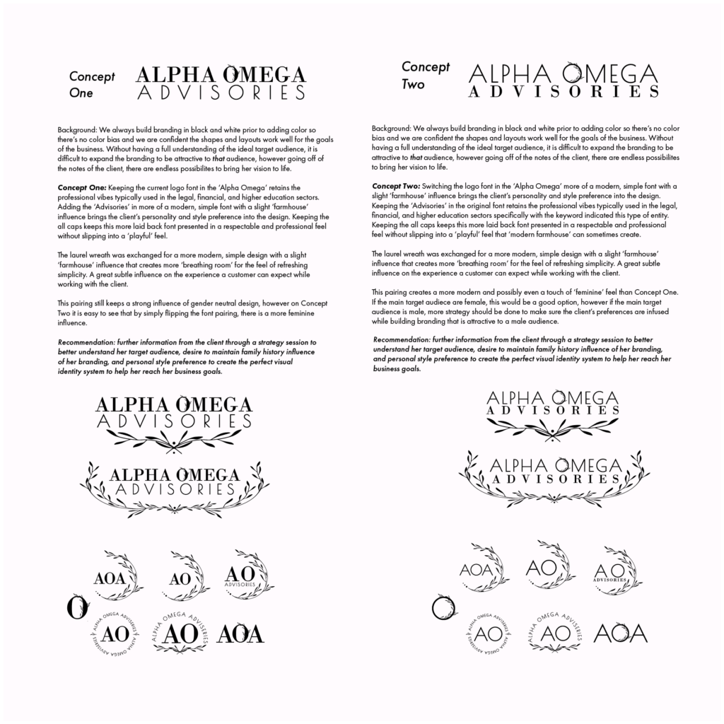
The breakthrough came when Stacie described wanting a “Joanna Gaines vibe” while acknowledging her target clients—mostly male decision-makers—wanted straight talk, not sugar-coating. This wasn’t a contradiction to solve; it was a competitive advantage to leverage.
The real emotional driver emerged when she shared the story behind her original logo: it was modeled after her father’s business mark. A respected entrepreneur who’d encouraged her to chase her dreams. She wanted to honor his legacy while building her own.
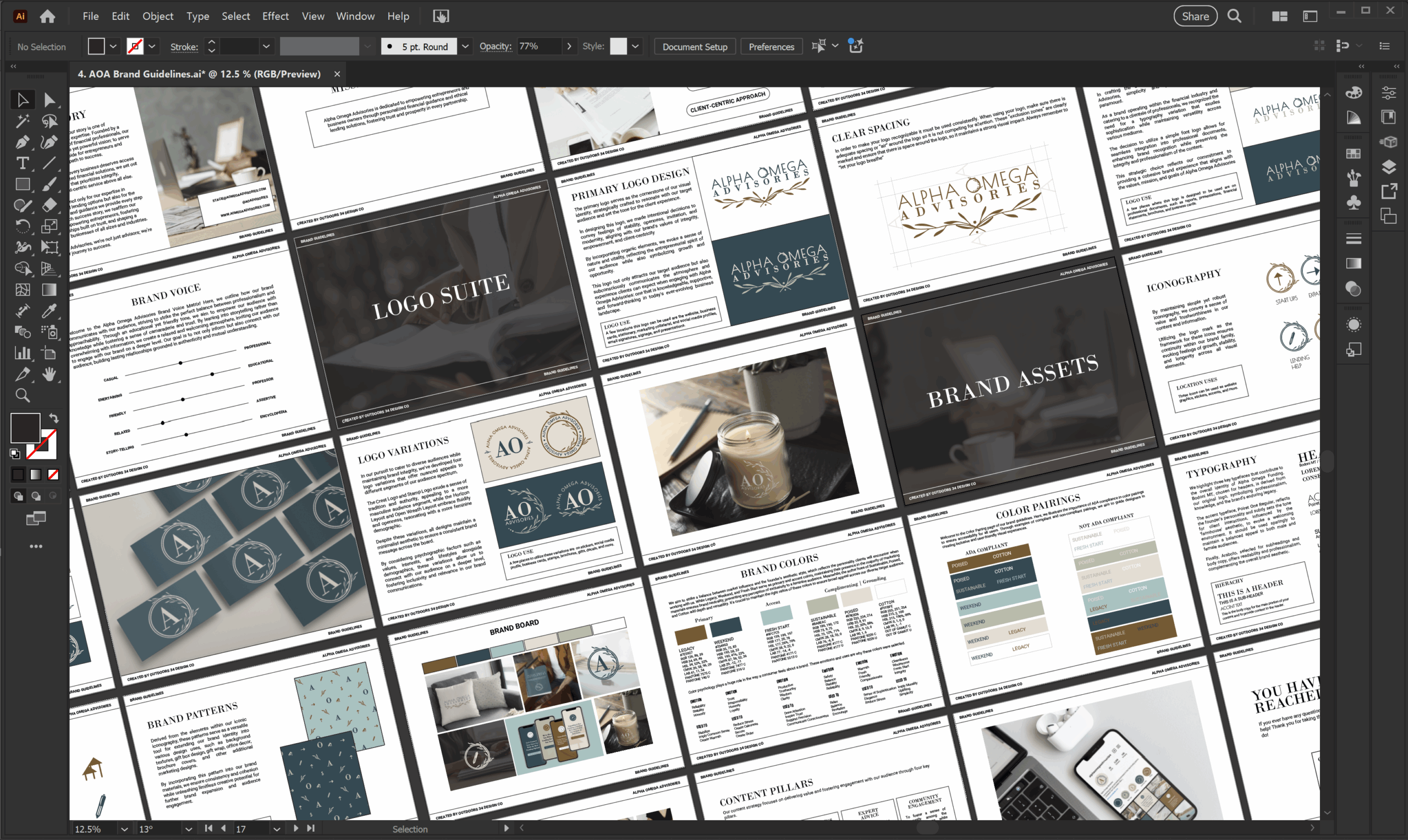
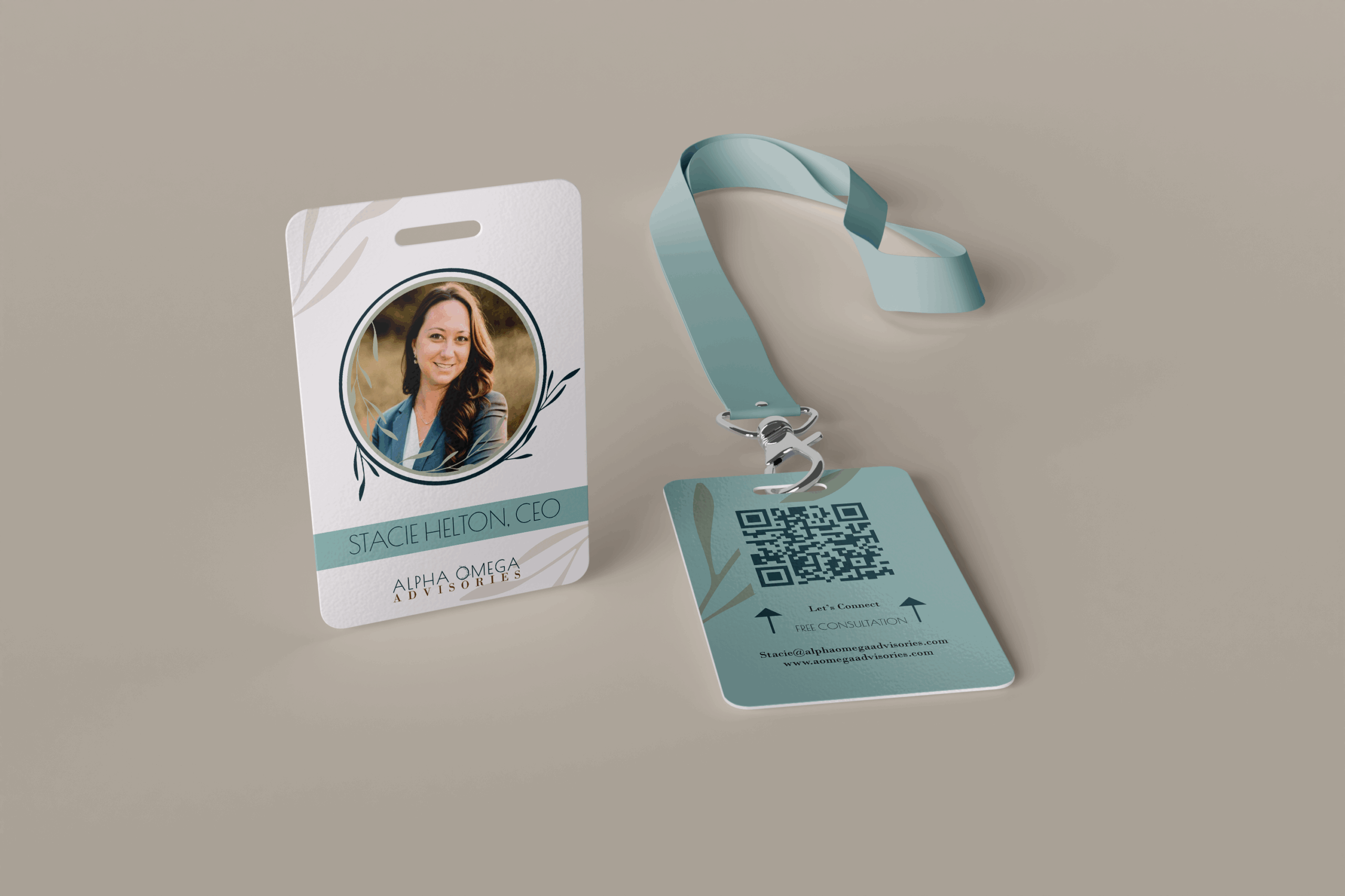
Our strategy became about recognition and growth—literally. We kept elements that connected her to her father’s respected reputation (the laurel wreath, similar typography weight) while modernizing everything else. The laurel shifted from decorative element to meaningful symbol: “She’s here to help others grow their dreams.”
We developed a dual-font system that could flex masculine or feminine depending on the audience, plus logo variations that let her materials lean traditional when needed. Every decision rode the strategic line between “who she authentically is” and “who her clients need her to be.”
crafting the brand assets_
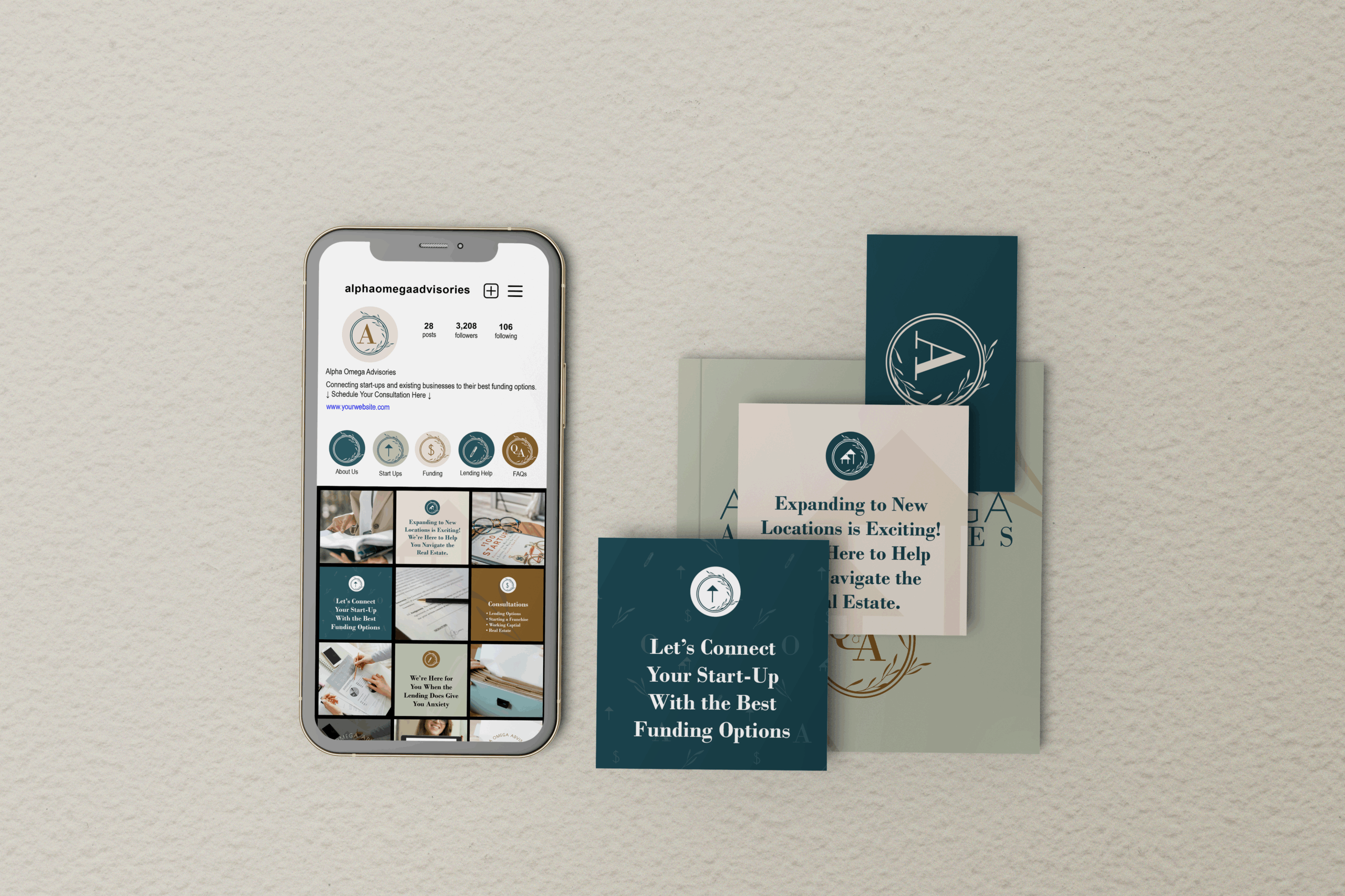
Supporting the brand identity, we developed a flexible icon system that reinforced the “growth through hospitality” positioning. Each icon represents a core service area—startups, expansions, real estate, lending guidance, funding options, and client Q&A.
The genius was in the dual approach: clean standalone icons for simple marketing materials, and laurel-wrapped versions that embody her full-service, hand-held experience. Using typography from her brand system, these icons could function as elegant page crests or section headers—sophisticated enough for professional presentations, simple enough for ease of implementation.
The laurel wreath became her signature element across all touchpoints, consistently communicating “you’re in caring, capable hands” whether clients encountered it on business cards, proposals, or digital materials.
crafting the logo system_
We developed a comprehensive logo system that balanced heritage with hospitality. The modernized laurel wreath honors her father’s legacy while symbolizing growth—both for her clients’ dreams and her expanding practice.
The dual typography approach strategically serves her diverse audience: clean, authoritative letterforms communicate credibility to male decision-makers, while the refined aesthetic appeals to her hospitality-driven approach. Multiple logo variations ensure she can flex between traditional business contexts and warmer, relationship-focused touchpoints.
Each mark maintains the core message: professional expertise delivered with genuine care.
marketing & networking_
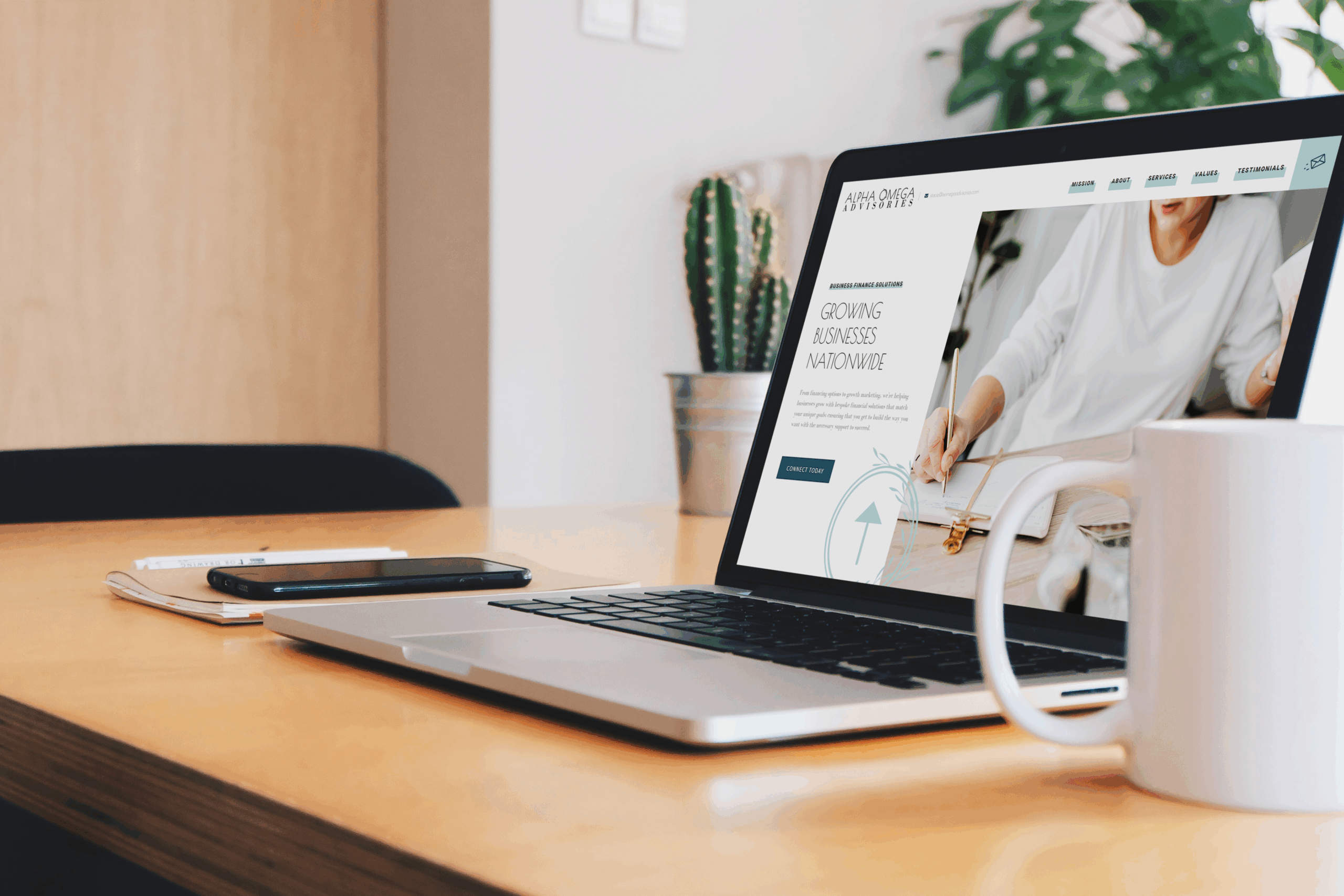
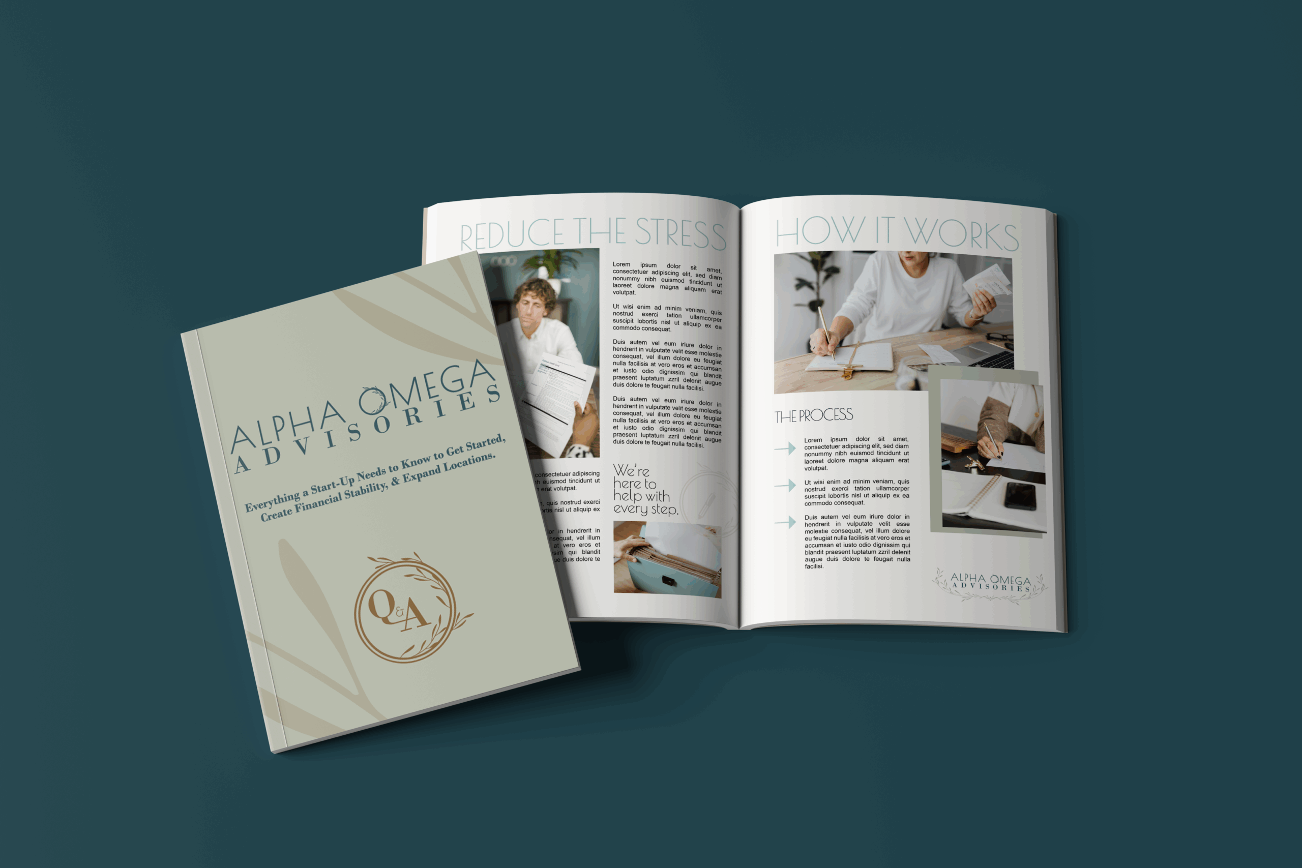
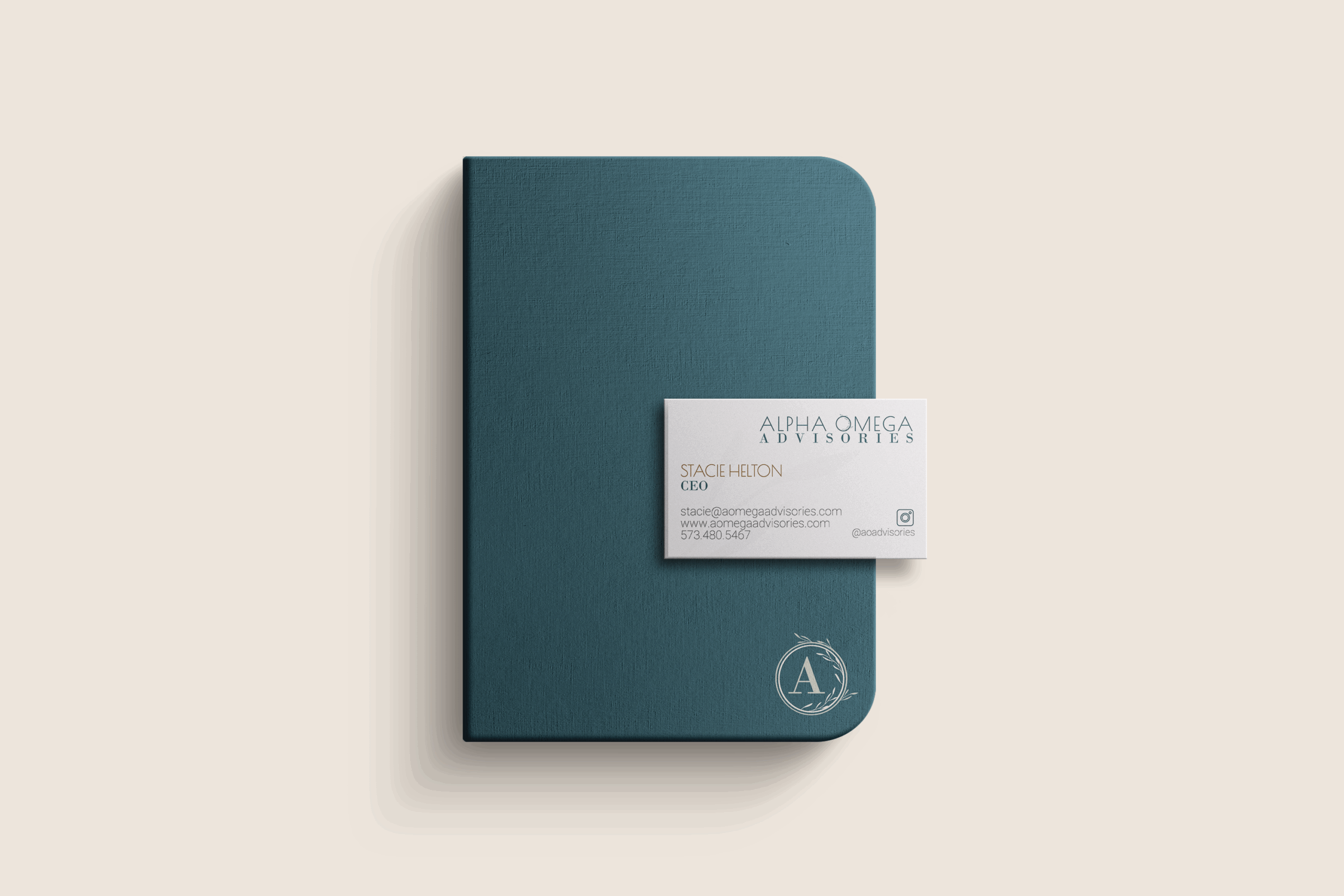
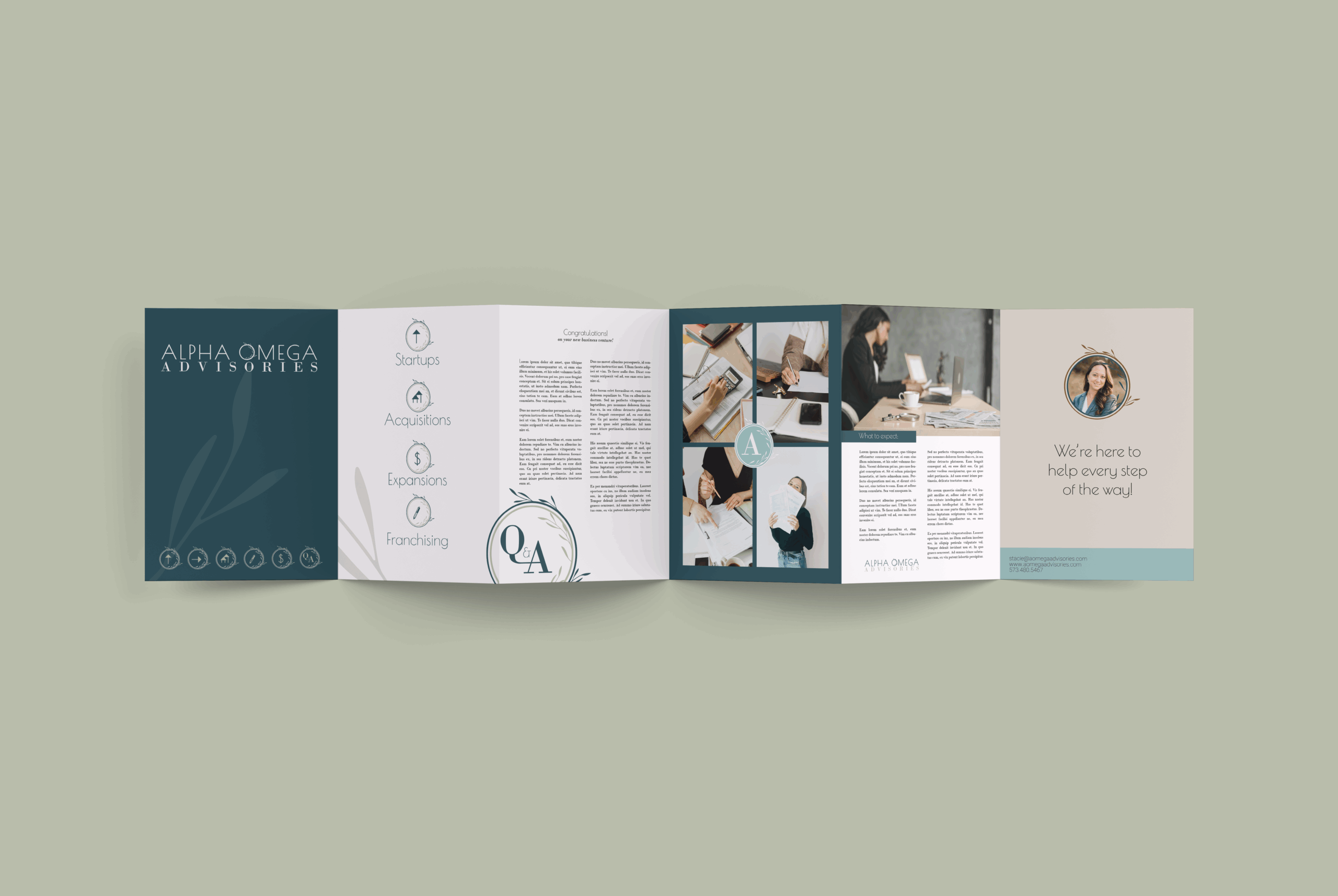
We then created a series of mockups to help tell the brand’s story visually and envision what assets would exist for networking, marketing, and free handouts and resources for lead captures and conversation starters.
touchpoints_ client experience
We explored customer touchpoints that could be infused into the customer journey to leave that lasting-impression with the personable and supportive feel the brand stands for.
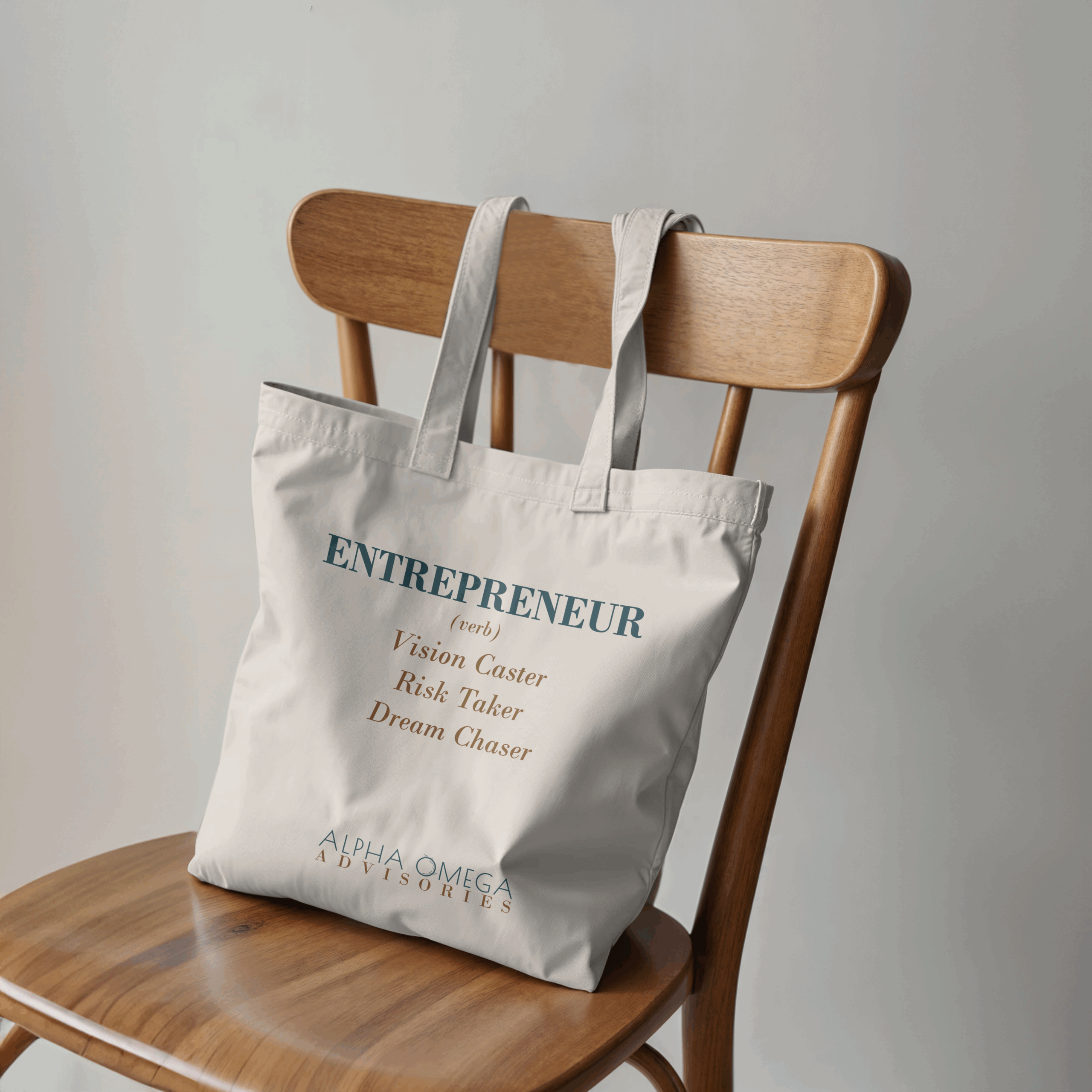
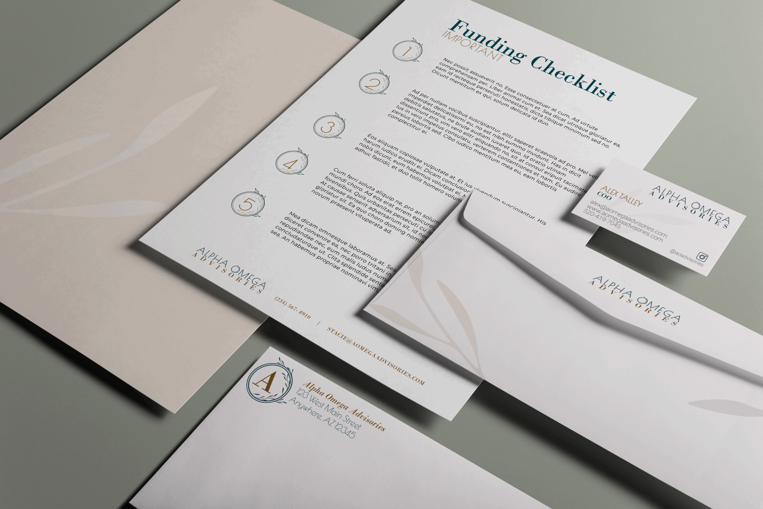
Entrepreneur Support Bag Stuffed with Resources; like Meetings Notebook, Personal Reps’ Contact Card, and Funding Checklist/To-Do List.
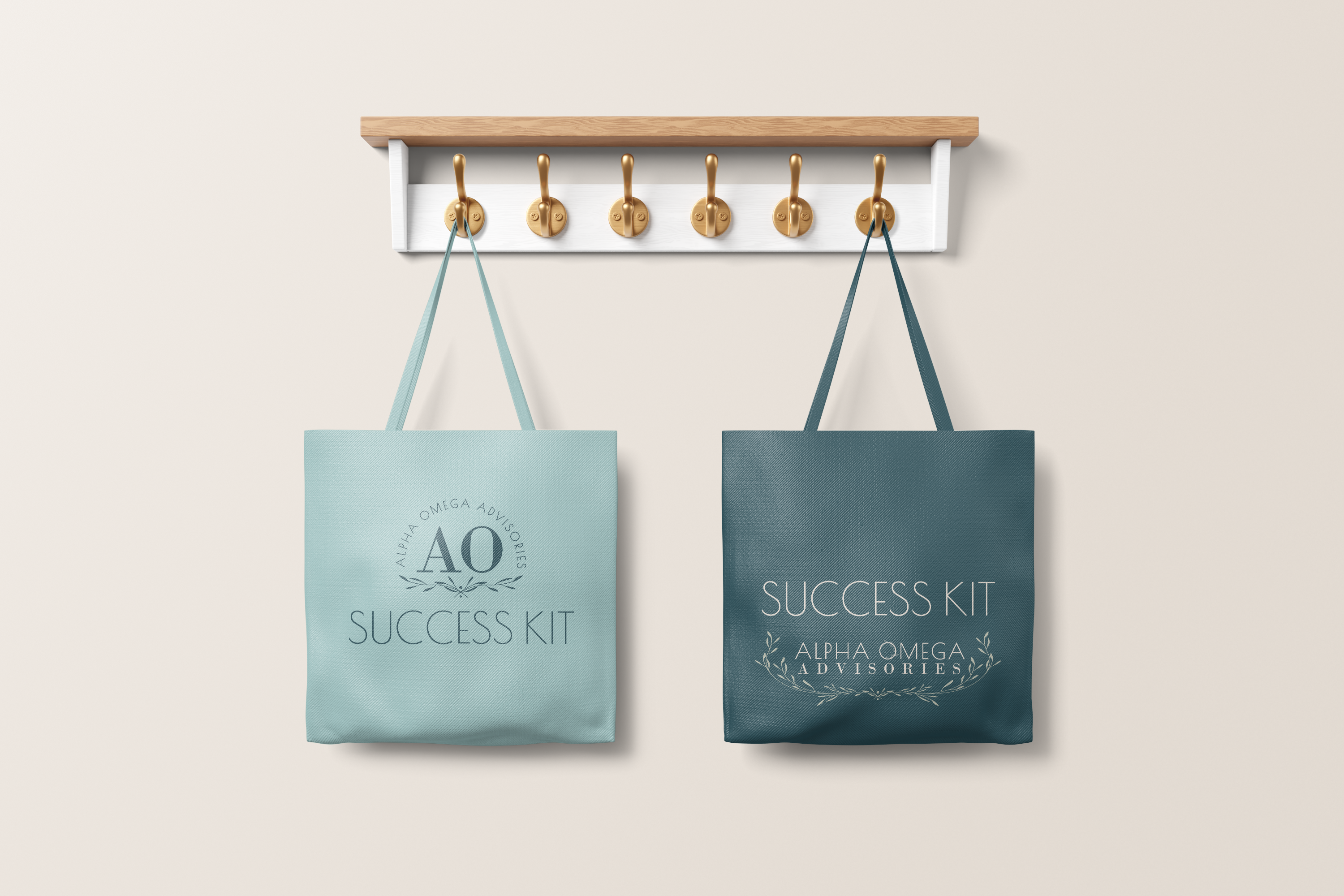
Post-Funding Success support_
This exploration offers experience items specifically for post-funding support. Ways to further wow the client and leave a lasting impression while also reminding the client of all the ways Alpha Omega Advisories can continue to serve them as they grow, much like how an experience-first realtor gives a house-warming gift.
THE OUTCOME_
When Stacie was unexpectedly laid off just months after establishing her new brand, she wasn’t panicked—she was ready. The strategic foundation we’d built allowed her to launch immediately as an established expert, not a startup advisor.The brand became her credibility catalyst. New clients saw decades of experience, not someone scrambling for legitimacy. Within her first year, she’d grown enough to bring on a sales manager and collaborate with specialty advisors under her practice.
The unforeseen blessing was how this project evolved into tandem support for more entrepreneurs. Stacie now uses her brand style guide as a portfolio piece, demonstrating the caliber of work her clients can expect throughout their journey. This trusted relationship created a unique value exchange: we structure payments around funding timelines while clients receive seamless, hospitality-focused service across both businesses—from funding through brand strategy, visual identity, marketing collateral, print and ship, all timed perfectly for their launch.
Client feedback says it all: “So glad we have you working as a team—tremendously less stress than other options.” They’re getting a coordinated support system that lets them transition rapidly with confidence.
This partnership didn’t just transform one business—it elevated both.